

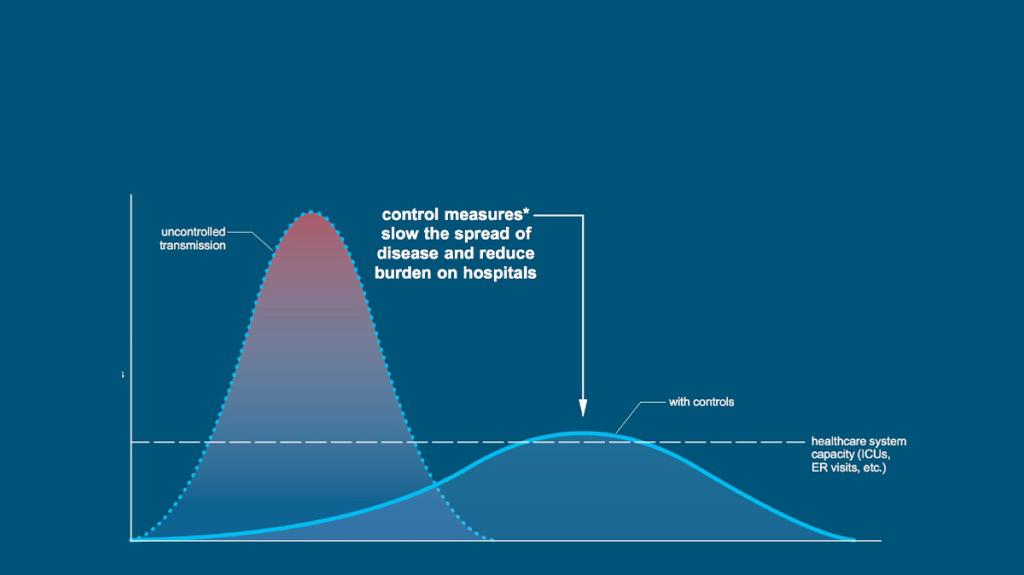

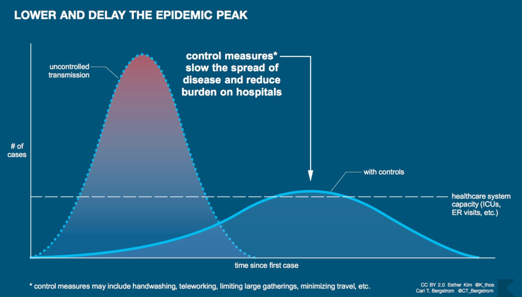
Most of us by now understand the need to ‘flatten the curve’ in order to reduce the number of overall cases of COVID-19 and to keep the peak of infections below the threshold of the capacity of the NHS. Staying at home, social distancing and lots of hand washing will undoubtedly help to achieve that and save lives. But staying at home and social distancing are such difficult things to do and we don’t yet have any idea of how much longer we will have to continue to do that, because we don’t know where we are on the curve.
This article attempts to answer the question of where we are on the curve, but firstly we look at some of the problems that the statisticians are wrestling with at the moment:
- We have no idea about how many people might be infected. The number of reported cases will depend on how many are being tested and who is being tested.
- The roll-out of increased testing to more people and to different groups makes it difficult to identify an underlying trend in the number of infections.
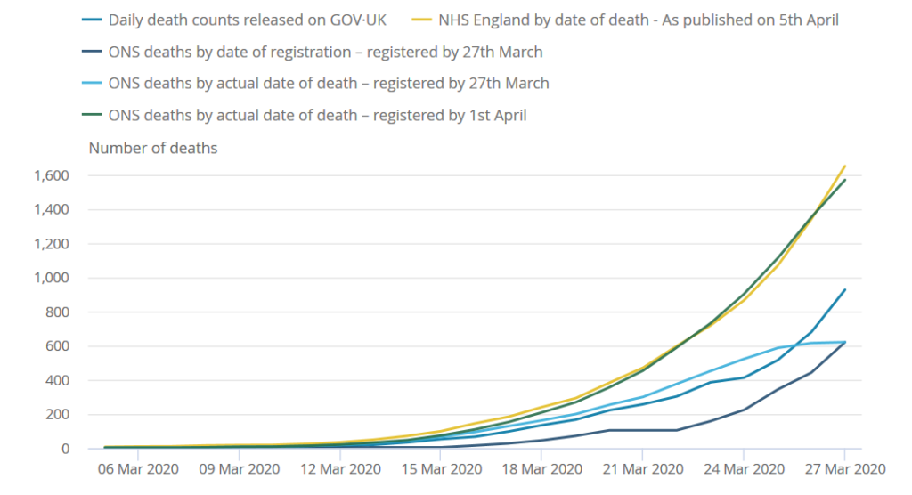
- The number of daily deaths reported will in some cases include people dying in nursing homes (as in Ireland), while in other cases (as in England) they will only include those dying in hospitals.
- There are delays in the reporting of deaths. These can give rise to fluctuations in daily death data, with some deaths occurring at weekends, for example, not being reported until the following Monday or Tuesday.
- In addition to some minor fluctuations in the death figures arising from reporting practices, there appears to be a systematic delay in reporting generally. So the number of deaths reported on a given day corresponds roughly to the actual number of deaths that occurred three days previously (see the graph below produced by the Office for National Statistics).

So the bottom line is we cannot use the numbers of reported cases of COVID-19 to ascertain where we are on the curve, and there are certainly a few problems with the reported number of deaths.
However, if we accept the fact that there are probably similar reporting delays in other countries and if the counting methodologies for deaths are at least consistent, then we should be able to obtain some idea of where we are by looking at what’s happening elsewhere. If we look at the curves for other countries such as Italy and Spain, where the situation is more advanced, we may at least get an idea of where we might be in a few weeks time.
In order to make the necessary comparisons, we need to do two things. Firstly, we need to iron out some of the daily fluctuations in the reporting of deaths. We have attempted to do this by using three day averages. Secondly, we need to convert the numbers to rates per one million population to account for the different population sizes.
We have not included Northern Ireland in the analysis as the numbers are too small, so we’ll just have to assume that we will be following a similar trend to the UK or Ireland.
This is the picture that emerges when we compare the COVID-19 death trends in the UK, Ireland, Spain, Italy, France and Germany (using daily deaths data from 1 March to 8 April 2020).

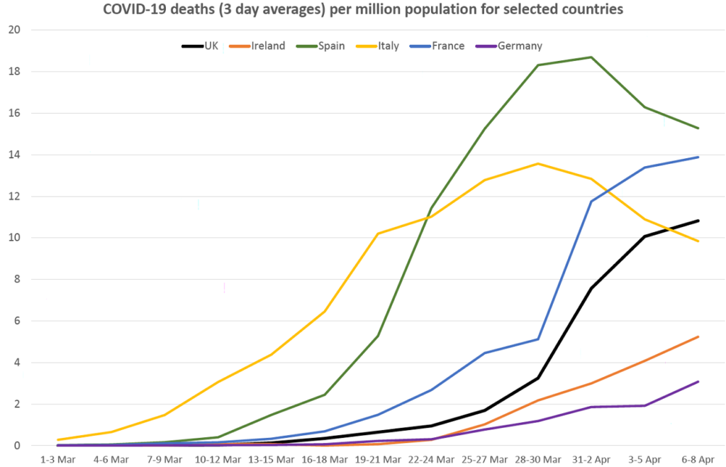
Some cause then for cautious optimism when we look at the curves for Spain and Italy. The curves for the UK and France appear to be starting to turn, while the situation in Ireland and Germany appears to be a bit further behind, although the curves there look as though they are going to be a bit flatter.
As these curves relate to deaths, they could be somewhere between two and four weeks behind the curves for new infections. It is therefore likely that infection rates are a bit further along the curve and somewhere close to the peak for the UK. That picture may become clearer within the next few weeks.