


Road safety is an area of critical importance to policy makers. In Northern Ireland, road traffic collisions remain a leading cause of preventable death and serious injury, placing lasting emotional, social and financial burdens on families and communities. Studying road traffic collisions helps us understand where, how and why collisions occur, enabling evidence‑based decisions to prevent future harm and to reduce the severity of injuries when collisions do happen.
This article introduces a new road traffic collision dashboard from the Assembly Research and Information Service (RaISe). The dashboard uses the Police Service of Northern Ireland statistics on injury road traffic collisions, presenting them in an interactive format that is intended to support scrutiny and analysis of road traffic collisions. This dashboard combines charts, filters and maps so users can quickly see where casualties are happening, who is affected, and under what circumstances collisions occur.

What is this dashboard and why does it matter?
This dashboard is designed to help MLAs and the wider public make sense of road traffic collision data across Northern Ireland. The Police Service of Northern Ireland statistics on injury road traffic collisions are the main source of information used for monitoring and tracking trends on the number of persons killed, seriously or slightly injured as a result of collisions on our roads. The data is collected by on-scene officers and collated and reported by PSNI Statistics Branch. This does not include incidents occurring on private roads or car parks, collisions reported to the police more than 30 days after they occurred, or incidents that did not result in personal injury.
This data dashboard uses the PSNI statistics which are available to the public on the OpenDataNI website (further information about the OpenData NI website and what it provides is available here). The dashboard combines 39 large datasets, representing over 70,000 collisions and over 100,000 casualties, from 2013-2025 and presents them in what is intended to be a user-friendly and accessible format. The dashboard will continue to be updated on an annual basis.
Part of this data is northing and easting coordinates which RaISe has spatially mapped to OpenStreetMap highway data. As with any spatial matching process, a proportionally small number of cases may not align perfectly with mapped roads or boundaries.
Starting with the big picture
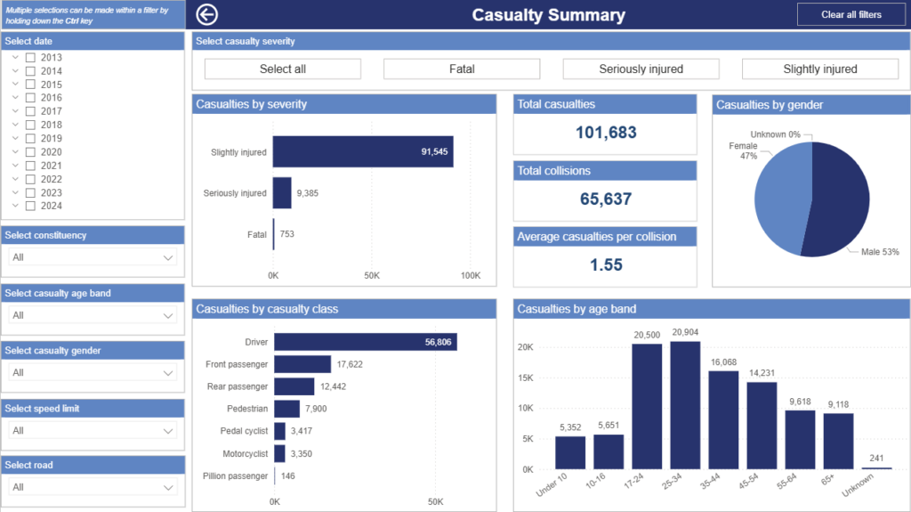
Following an introductory page which sets out the various pages, data filters and key terms, the main dashboard begins a high level overview of road traffic collisions and casualties across Northern Ireland over the period 2013-2025.
This page brings together headline totals for casualties and collisions with a series of charts that break casualties down by severity, gender, age band and casualty class (such as driver, passenger, pedestrian or cyclist). You will quickly see, for example, how many people were slightly, seriously or fatally injured, the overall number of collisions, and the average number of casualties per collision.
A range of filters along the side of the page (including year, casualty severity, constituency, age band, casualty class, speed limit and road) allow you to narrow your analysis to specific time periods, groups or locations. These same filters are available on each of the interactive pages on the dashboard.
Importantly, the filters mean that the data visualisations on the page aren’t fixed. As you apply the filters or focus on a particular constituency, road, time period or group, the figures update automatically. This means the headline view and visualisations always reflects exactly what you are looking at.

Changes over time
The ‘Trend Over Time’ page in the dashboard focuses on how collision rates change over years, months, weeks and days. Line charts clearly show a significant reduction in collisions over the period studied. The matrix heat map presents collisions by day of week and time of day. As would be expected, you will see that the highest number of collisions occur when most people are driving: the am and pm rush hours, Monday to Friday.
Using the filters to select fatal accidents you will see that the higher number of collisions does not lead to a higher fatality rate. Collision outcomes worsen at weekends for example, relative to the number of collisions. This could be due to a number of factors, including speed i.e. less traffic allows for faster moving vehicles. Interestingly, if you select fatal collisions and younger age cohorts (as demonstrated in the short video below) it can be seen that many occur after 9PM and at weekends. In particular, fatal collisions in these younger cohorts spike between the hours of midnight and 4am on Saturdays and Sundays.
The Department for Infrastructure is seeking to address this issue through the recently announced introduction of graduated driver licences for the under 24 age group. This data may lend support to the introduction of the night-time driving restrictions of young and newly qualified drivers being brought in under the new scheme.

A map that tells a story
The central feature of the dashboard is the collision location map. Overall, this page is designed to help identify collision hotspots, explore patterns by severity and road characteristics.
The interactive map shows individual collision points which display the geographic distribution of road traffic collisions across Northern Ireland. The filters on the side allow you to explore collisions in smaller geographies such as Northern Ireland Assembly constituency level or by road name. Your search area can be customised further using the tools in the top left hand corner of the map. By clicking on the search icon, you can enter an address or place name , for example a town or village you are interested in. You can also use one of the shape tools (square, circle, lasso) which will enable you to explore a more customisable area. The following video demonstrates how to use these features (please note that the video has no sound).

Further geographic analysis of road traffic collisions can be done using the casualty heat map. This map makes it easy to spot geographical patterns at a glance as constituencies with higher casualty numbers appear darker, while those with fewer casualties are lighter. This is particularly useful if you are interested in constituency level data, or for comparing a number of constituencies side-by-side. One or more constituencies can be selected for comparison using Ctrl + click.
While the map is useful for visualising geography, the data table to the right provides greater detail allowing you to make clear comparisons between constituencies. It quickly answers questions such as:
- Which constituencies have the highest number of casualties?
- How big is the gap between the highest and lowest areas?
- Does one constituency stand out significantly from the rest?
This map is useful in showing that the areas with the highest number of casualties are not necessarily the areas with the highest number of fatal or serious casualties. It shows that while there are a higher number of casualties in urban constituencies, which is understandable with higher traffic volumes, more sparsely populated rural constituencies such as Fermanagh/South Tyrone and North Antrim have fewer casualties overall but a higher proportion of serious or fatal outcomes.
This raises different policy questions; for example, is the national speed limit appropriate on all rural roads? Is 30mph appropriate for urban areas with a high level of collisions? A consultation on speed limits from the Department for Infrastructure closed on 22 April 2026. The consultation aimed to gather public opinions on various aspects of speed limits, including the expansion of 20mph zones in urban areas and national speed limits on rural single and dual carriageway roads.
Speed kills
There is a page looking specifically at carriageway type and speed that provides some interesting insights. You will see that most collisions are not happening on motorways or strategic roads, but on local roads people use most days. Single carriageway roads account for the greatest number of casualties, and 30mph roads, typically found in urban and residential areas, see the highest overall volume of injuries. Roads with speed limits between 60-70mph are predominantly rural single carriageway roads, and these roads have by far the highest level of both fatal and serious collisions.

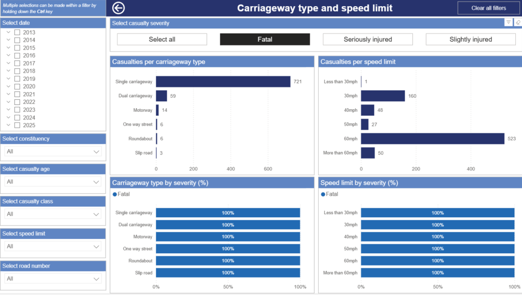
The data reinforces how speed and design interact to shape outcomes. While collisions at lower speeds are more likely to result in slight injury, the cumulative burden of harm remains substantial due to the frequency of incidents. As speed limits rise, collisions become less frequent but far more severe, with a markedly higher proportion resulting in serious or fatal injury.
How does the environment affect road safety?
This page examines how environmental conditions at the time of a collision relate to road traffic casualties in Northern Ireland, focusing on light conditions, road surface conditions, and weather conditions. The top row of charts shows the total number of casualties recorded under each condition, providing an overview of where casualties most frequently occur across different environmental scenarios. The bottom row presents the percentage breakdown of serious and fatal casualties within each condition, highlighting how the severity profile differs between lighting, surface, and weather types.
It is important to note that data on weather, light, and road surface conditions are only collected for collisions resulting in a serious or fatal casualty. For this reason, the casualty severity filter has been removed from this page, and all data shown relates exclusively to casualties with serious or fatal outcomes. The percentage charts therefore illustrate the relative severity distribution within each condition, rather than overall risk.
The ’cause of casualty’ page shows the number of casualties broken down by the recorded cause or contributory factor of the collision. This is the only static chart in the dashboard, i.e. there are no filters. Each stacked column represents a year, and is made up of the recorded cause or contributory factor of accidents for that year. This page can be used to identify behavioural risk factors rather than where and when collisions happen, like the other pages.
What can the dashboard be used for?
We hope MLAs and the wider public find this dashboard useful. It has been designed to provide a practical, user‑friendly way to explore road traffic casualties across Northern Ireland. By combining headline figures, maps, ranked comparisons and a rich set of filters, it will allow you to move easily between the big picture and fine detail. Taken together, the visuals and filters make this dashboard useful for a wide range of purposes. It can support:
- Road safety policy development, by highlighting where and how harm is occurring;
- Targeting interventions, such as infrastructure changes, speed limit reviews, enforcement or education campaigns;
- Monitoring change over time, including the impact of road investment, new policies or initiatives;
- Briefing decision‑makers, by providing a clear, visual way to communicate complex data; and
- Because it is interactive and visual, the dashboard is accessible to non-specialists while still offering depth for more detailed exploration.
It is important to note that while the dashboard allows for in‑depth exploration through its array of filters, patterns observed should be interpreted with care, as the dashboard presents descriptive data and does not test for statistical significance or control for the interaction between multiple factors.