This is a follow-up to the recent blog article, ‘Where are we on the COVID-19 curve?. The previous article used three day averages for COVID-19 deaths to compare the positions of the UK and Ireland with those of Spain, Italy, France and Germany. This article provides an update on that and also includes Northern Ireland. The three day averages have been replaced with five day moving averages to iron out fluctuations arising from reporting delays and to allow a daily update in the RaISe blog article, Visualisation of COVID-19 in Northern Ireland.
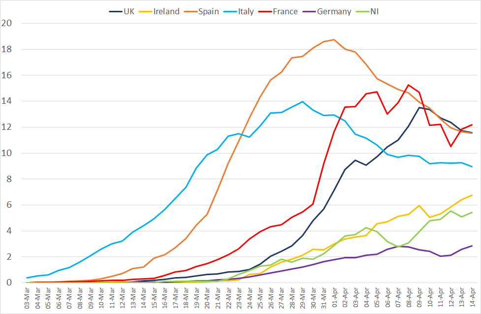
This is the picture that emerges when we compare the COVID-19 death trends in the UK, Ireland, Spain, Italy, France, Germany and Northern Ireland (using daily deaths data from 1 March to 16 April 2020). We are aware of the under-reporting of daily deaths in some countries, such as the UK, and have therefore confined our analysis to underlying trends as opposed to numbers of deaths.
As in the previous analysis, there appears to be some cause for cautious optimism when we look at the curves for Spain and Italy. The curves for the UK and France are also starting to turn, while the situation in Northern Ireland, the Republic of Ireland and Germany appears to be a bit further behind (although the curves there look a lot flatter at this point in time).
It would appear that Northern Ireland and the Republic of Ireland are following similar trends, but have not yet reached their peak. However, as these curves relate to deaths, they could be somewhere between two and four weeks behind the curves for new infections (which we cannot reliably identify due to ongoing changes in testing practices).
Please refer to the article Visualisation of COVID-19 in Northern Ireland for daily updates of this analysis.