Data visualisation is the representation of information and data using charts, graphs, maps, and other visual tools.
We have created the following data visualisations to present large amounts of information in an accessible, easy-to-interpret manner and help illustrate the information in a way that might not be possible with the data alone.
Many of our visualisations have been configured using the Microsoft Power BI analytics service. You can find guidance on Power BI’s accessibility features on the Microsoft website. This contains advice on how to use keyboard navigation and screen readers with Power BI as well as general recommendations.
If you are still having access issues and would like the information provided in a different format, please contact [email protected] and we will do our best to facilitate your request.
This dashboard uses the Police Service of Northern Ireland statistics on injury road traffic collisions, presenting them in an interactive format that is intended to support scrutiny and analysis
This dashboard provides a summary of analyses for different publicly available data sources about investment and engagement in arts and cultural services. (Scroll down to view each of the
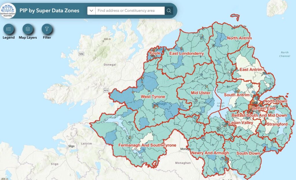
The interactive map highlights the locations (spatial areas) in each of the 18 constituencies where the impact of proposed changes to PIP are likely to be most pronounced.
Foodbanks are an increasingly useful resource for many. This interactive mapping application provides the location and contact details of all currently operational foodbanks, as of December 2020.