


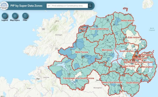
Personal Independence Payment (PIP) in Northern Ireland: PIP Recipients by Parliamentary Constituency
The interactive map highlights the locations (spatial areas) in each of the 18 constituencies where the impact of proposed changes to PIP are likely to be most pronounced.

Visualisation of COVID-19 in Northern Ireland
This dashboard has been prepared by the Assembly Research and Information Service to visualise data describing the spread of COVID-19 in Northern Ireland.

How has COVID-19 emergency funding for individual artists been distributed in Northern Ireland?
This visualisation provides a snapshot of £11.1 million in emergency funding provided to over 2824 individual artists in Northern Ireland.

The impact of COVID-19 on Northern Ireland
This visualisation based on analysis published by Ulster Bank, Danske Bank, NISRA, PSNI and Google Mobility Reports, looks at the potential impact of the COVID-19 pandemic in Northern Ireland.
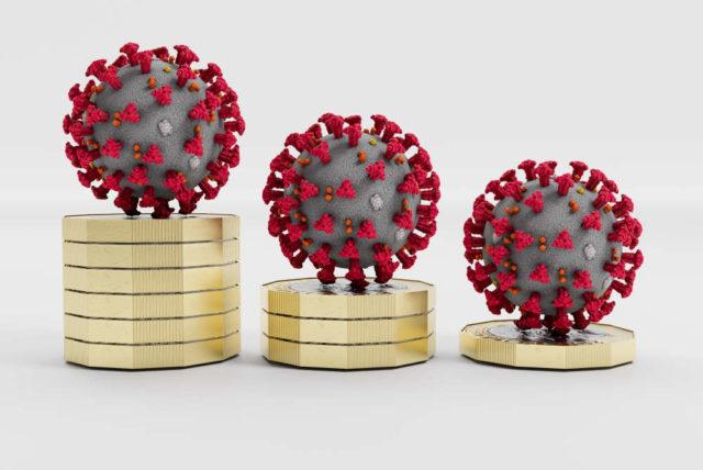
Snapshot of COVID-19 Funding: Department for Communities
This visualisation provides a series of interactive graphs which offer a snapshot of funding to address key challenges arising from the effects of the COVID-19.
Executive Budget 2021-22
This Interactive Timeline illustrates the complexity of the situation surrounding the formation of the draft Executive Budget 2021-22.

How has COVID-19 Emergency Funding for the arts and culture Sectors in Northern Ireland been distributed?
This visualisation provides a snapshot of emergency funding provided to the arts and culture sectors in Northern Ireland.

A snapshot of COVID-19 funding (updated November 2020)
This visualisation provides a series of interactive graphs compiled by RaISe, offering a snapshot of funding allocated to address key challenges arising from the effects of the pandemic.
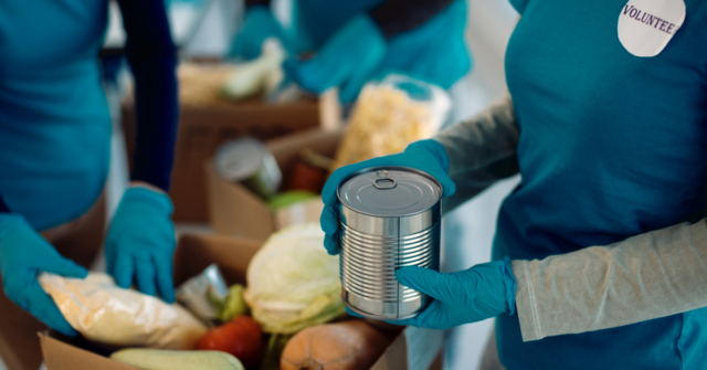
Foodbank distribution in Northern Ireland
Foodbanks are an increasingly useful resource for many. This interactive mapping application provides the location and contact details of all currently operational foodbanks, as of December 2020.
A snapshot of COVID-19 funding
This visualisation provides a series of interactive graphs compiled by RaISe, offering a snapshot of government funding allocated to address key challenges arising from the effects of the pandemic.
 Assembly Library on Twitter
 Northern Ireland Assembly on Facebook